The Typography of Quip
At Quip, we set out to make a productivity suite that is simple to use. We put a great deal of thought into the typography and themes in the product so you can express yourself without being overwhelmed with thousands of formatting options.
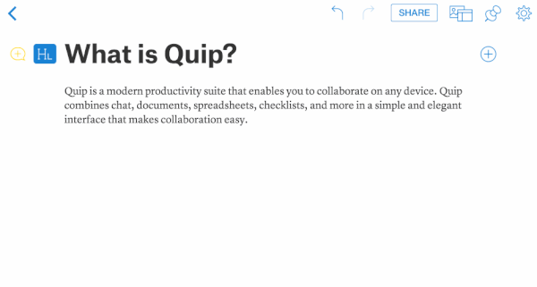
To select a theme, click on the gear menu in the top right of your document:
Continue reading to find out more about each Quip theme and the typefaces we chose for each.
Atlas
Atlas is the default theme in Quip. It was designed to be versatile while having a distinctive character. We chose a serif/sans-serif pairing to provide a distinctive look uncommon in traditional document editors, yet still applicable to many tasks. The other four themes are more tailored for specific use cases or certain aesthetic tastes, but we designed Atlas to look great in almost any context.
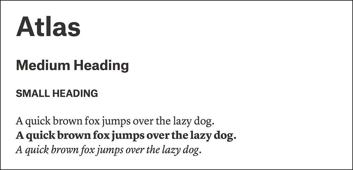
Typefaces: The headings are Atlas Grotesk — a beautiful sans-serif typeface that was inspired by well-known typefaces Helvetica and Mercator. The body copy is Lyon Text — a contemporary serif that looks great on digital interfaces.
Ideal for: Anything and everything.
Modern
We created the Modern theme for those who prefer sans-serif typefaces and a clean, sleek aesthetic. It uses a revival of Helvetica that retains the character and warmth of the original cut.
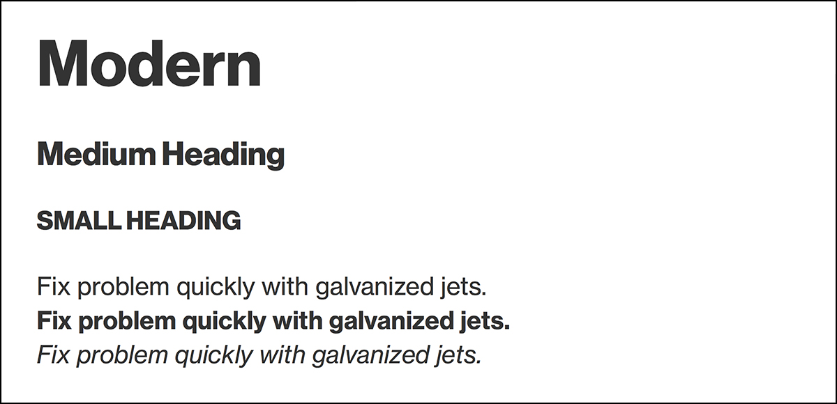
Typeface: Neue Haas Grotesk is a modern revival of the original Helvetica and has some subtle differences that make it slightly more expressive and perfect for digital document creation.
Ideal for: Design documents, project plans, to-do lists
Byline
We created Byline as the serifed counterpart to Modern — clean and legible, while invoking the classic feel of a magazine or newspaper.
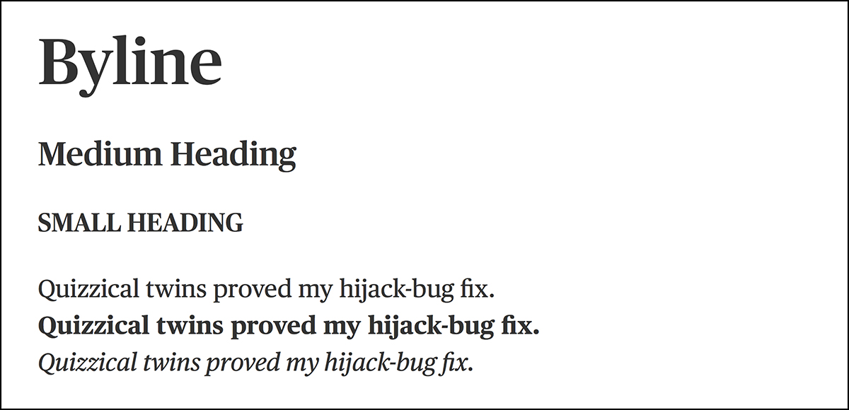
Typeface: Byline is made up of a typeface called Publico that was originally designed for The Guardian, the popular UK newspaper. The Guardian decided not to use the typeface, but it was eventually revitalized for a Portuguese newspaper. The resulting typeface is modern serif that looks great on digital interfaces.
Ideal for: An essay, restaurant review, letters to the editor
Marseilles
Quip is not only used by companies, but also between family and friends to plan birthday parties, create grocery lists, and plan family vacations. Although you won't find any Comic Sans or Curlz MT in Quip, we wanted to create a theme for the fun and casual uses of Quip.
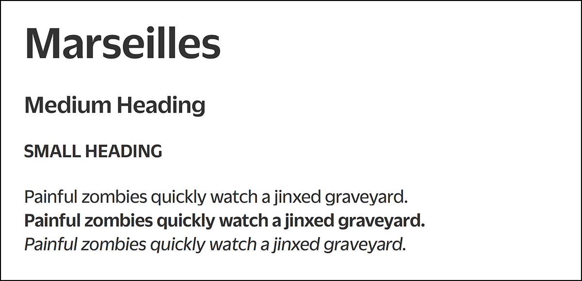
Typeface: Duplicate Sans — a revival of a popular midcentury European sans-serif type that is full of subtle whimsy.
Ideal for: Travel plan, wedding speech, letter to a friend
Manuscript
Even though Quip isn't explicitly a screenwriting tool, the Manuscript theme is for lovers of monospaced type and the classic look of a script written on a typewriter. It also has a different layout than the other themes — the headings are centered, rather than left justified. Go ahead and use Manuscript to unleash your inner Hemingway, even if you are simply typing a blog post about type themes.
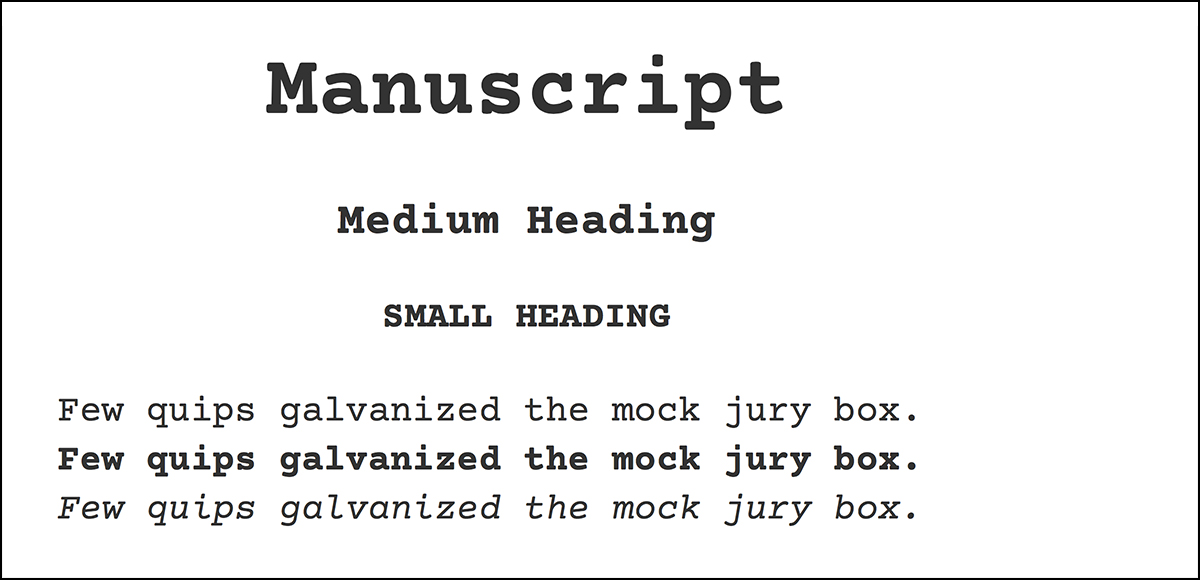
Typeface: Courier Prime is a version of Courier specifically designed for script writing by screenwriter and designer John August.
Ideal for: Interview transcripts, writing a blog post in Markdown, drafting a short story
A Final Point
Creating a simple and delightful experience is very important to us at Quip. We are always working on new features and refinements, so if you have suggestions please drop us a line or reach out on Twitter or Facebook. We love hearing from you.
If you want to find out more about how Quip can help your business or team, request a live demo.