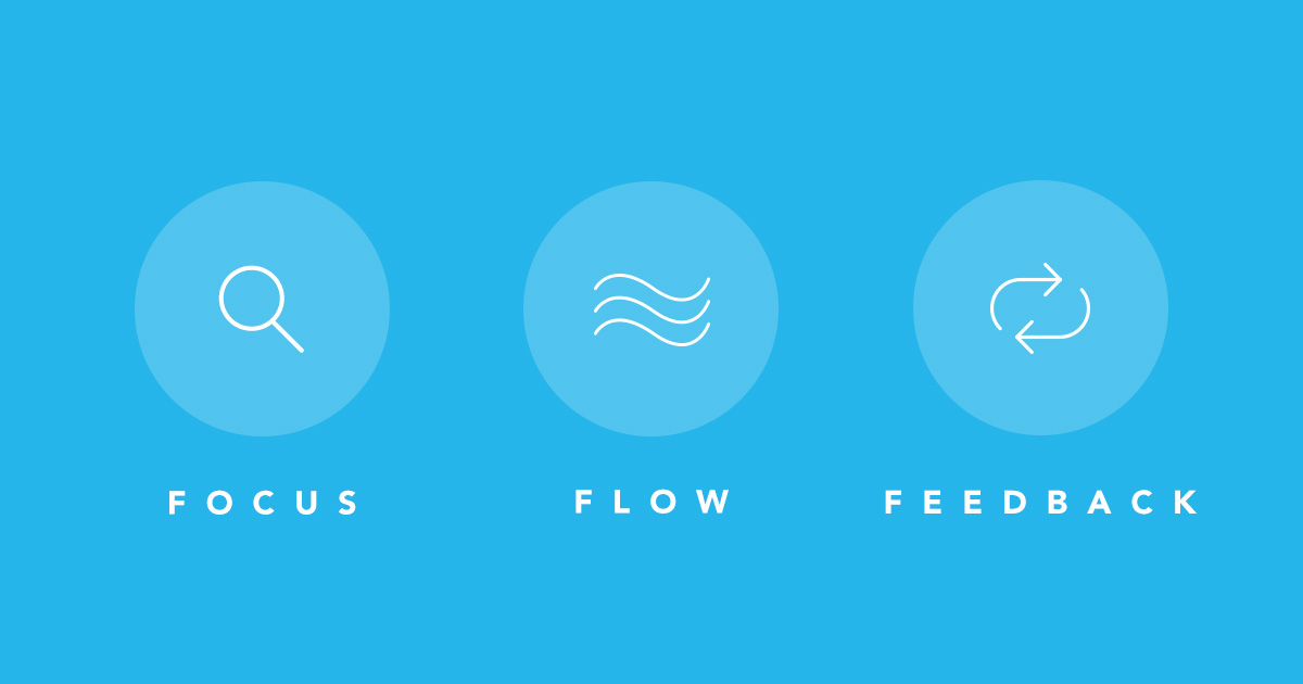
Focus, flow, and feedback: How Quip fuels strong teams
We build Quip to work the way strong teams do. Our all-new 2017 design reflects everything we've learned about team productivity since we first launched Quip in July 2013.
At the core of Quip's product is a simple philosophy: We learn by listening. At Quip, over half of our small team works directly with customers — including all three of our product managers. We mine a mountain of deep conversations for common needs and emerging workflows that we can support through thoughtful feature design. We use our own product for this, too — Quip's Twitter integration lets us pipe Tweets to and about @quip into a chat room where the entire team reads what people are saying. We act on urgent points, and absorb more nuanced ones into our product design and engineering process. Quip's new design responds to some of the most consistent pieces of feedback we've received over the past year.
At the same time, we learn from research. Dispatches from the bleeding edge of collaboration research fly around our office, informing hallway conversations and product design. Finally, we learn by doing. We consider our small team to be a group of experimenters, always coming up with new ways of working and testing them over time. The Quip team uses Quip for absolutely everything: project plans, to-do lists, event planning, meeting notes, strategy docs. Everything. As we grow, we keep asking ourselves: How can Quip continue to serve as a tool for decisive action informed by broad awareness? And whenever we hit on a new insight, we build it into Quip as fast as we can.
Ultimately, we've learned that strong teams work fast, act friendly, and embrace fun. To pave the way for the future of work as we see it through that lens, we've redesigned Quip from the ground up. Our new design elevates focus, flow, and feedback — the three drivers of team productivity.
Focus
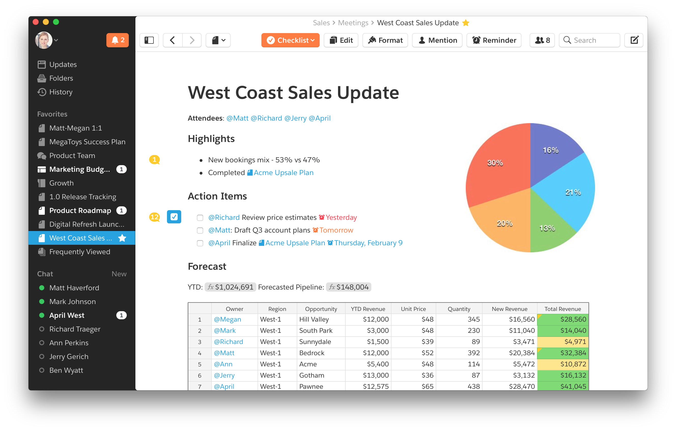
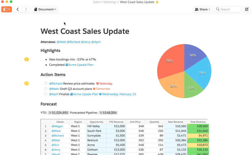
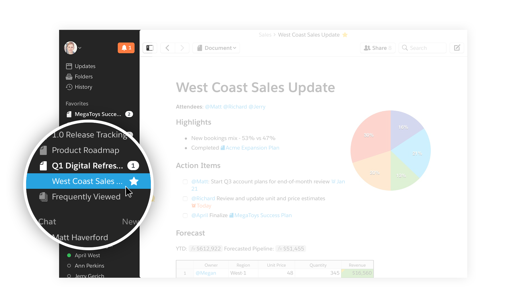
Quip's new design uses color to shape focus. The bright white content area takes center stage while the dark gray, slightly translucent sidebar chills out on the sidelines, waiting to lend a hand to quick context-switching. The sidebar button becomes solid orange when notifications await, offering a clear hint of where to turn your attention next. Once the sidebar is open, the Favorites section serves as a home for the working set of documents you've chosen to focus on. And when you open a shared document, the conversation shows up alongside it within the bright white content area, bringing into focus what your teammates are saying and what's changed.
Meanwhile, Quip's emphasis on minimalistic formatting remains. All the bells and whistles of fonts and colors can be deceivingly distracting — so we built Quip with a low overhead to getting started. Docs have a fresh, legible look and feel with limited formatting options on purpose. Meanwhile, Quip's contextual document, spreadsheet, and checklist menus come into view when your cursor is focused in a section where they’d be handy—there when you need them, gone when you don't. The result is that work happens faster, and teams build a shared understanding of what work looks like and how it gets done. Quip's docs are already effortlessly beautiful, so you don't have to spend time making them that way.
Finally, Quip boosts focus by being fast. The fastest tools are built by people obsessed with technical performance, which Quip's industry-leading engineering team certainly is. But that's just the beginning. Fast is also about feedback loops driven by direct mentions—knowing when your attention is needed where, and being able to respond from wherever you are, whether that happens to be a web browser, one of our desktop apps, or Quip's iOS and Android apps on the go.
Flow
Team productivity is a dance between responsive conversation and heads-down creation, and the new Quip carves out space for both. The best real-life example I can describe is my own, so here's a typical day for me in Quip.
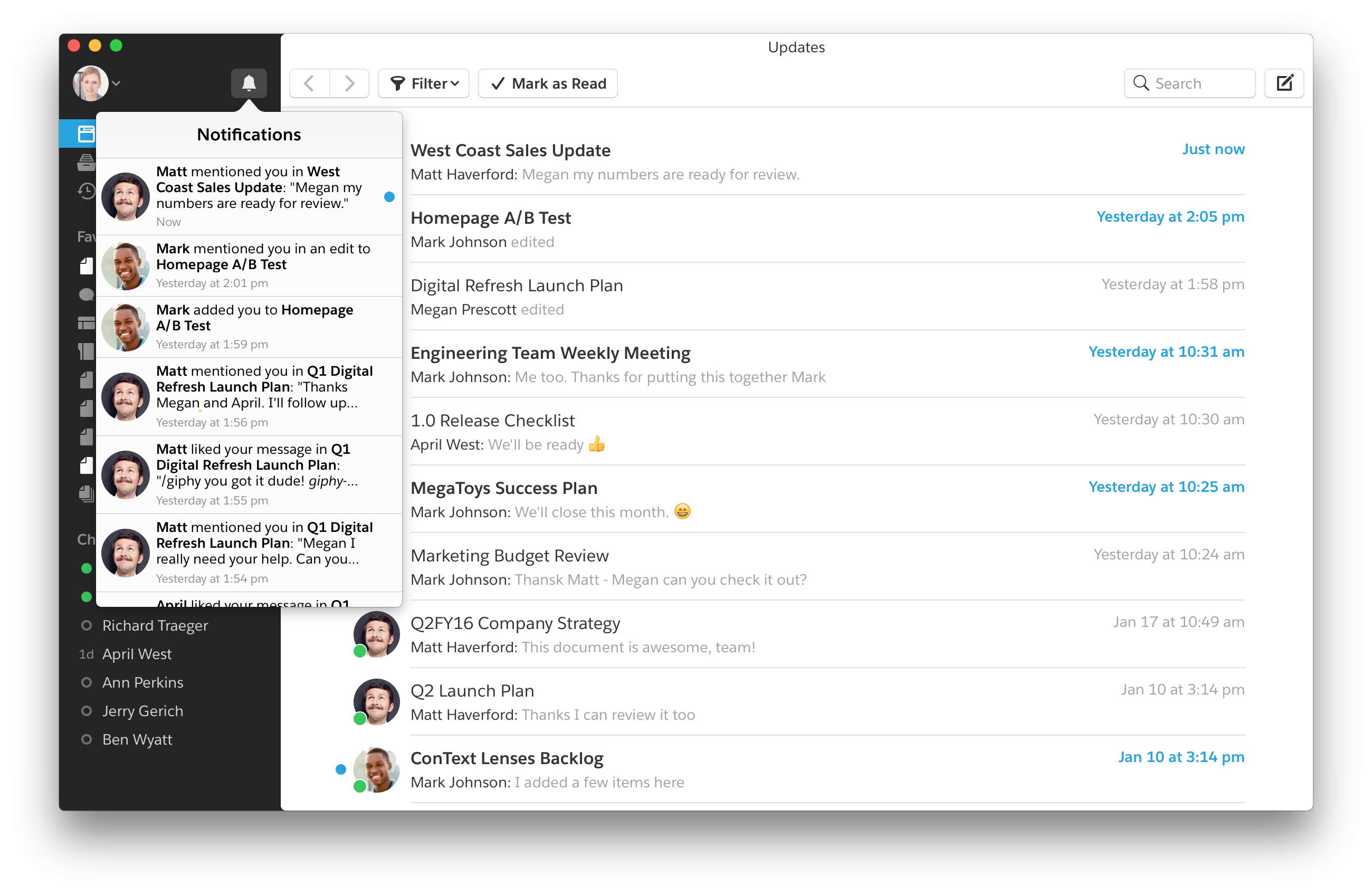
As a product manager, I start the morning by checking the notification bell (usually on my phone), where I can browse through what's beckoning my attention. Just like on social networks, anytime someone mentions me in a document or a chat that I'm shared on, a notification is triggered. And now with Reminders, my past self can keep my future self on track by setting a notification that will fire off exactly when I need it to.
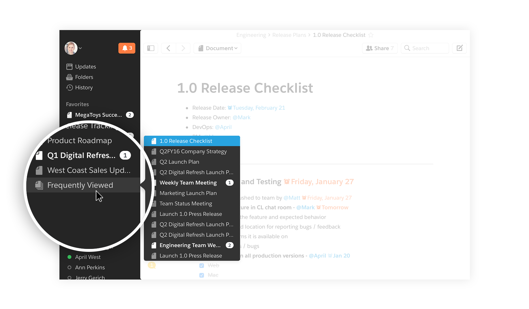
Once I've glanced through my notifications, I move to the sidebar. The sidebar is designed to give me quick access to all the docs I've been investing attention in recently, for as long as they're still relevant.
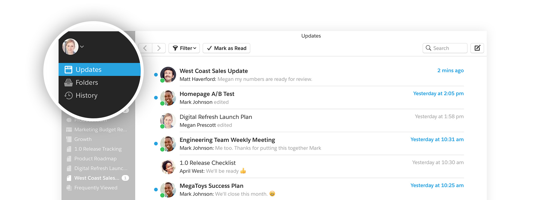
After I check out my sidebar and tend to any docs and chats that need my attention, I like to scan through my Updates feed to see all the latest action on docs and chat rooms across the company. The Updates feed gives me the superpower of ambient awareness: I always have my finger on the pulse of where my teammates are spending their time, which influences how I spend mine.
For staying in your flow, there's nothing better than Quip's approach to keyboard shortcuts and in-line actions, which we've carried forward into the new design. If you buy into productivity gurus' claims that doing everything from your keyboard without mousing around is the secret to moving at the speed of thought — and I certainly do — the messiness of traditional keyboard shortcuts is infuriating. It's like they don't want to be learned. Quip to the rescue, at a bunch of different levels:
- The almighty @ key is a quick way to add all kinds of things to your documents.
- Markdown syntax works like a dream in Quip!
- When in doubt, backtick. Hit the ` key to see your formatting options.
- Bring your emojis to work. Just type the : key to get started.
For in-line actions — things you can do in context, alongside text and images — we go a step further than most productivity apps, which focus on the right-click menu.
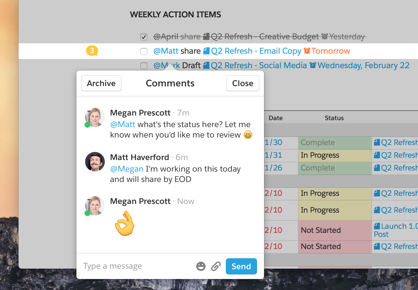
- A comment bubble shows up to the left of the line that's in focus, inviting you to start a conversation in context.
- The style square serves as an indicator of a text section's style, as well as a quick-switcher.
- Selected text sports a formatting popover with bold, italic, underline, and other options.
- The Tools bubble gives an overview of everything you can add to a doc (checklists! spreadsheets! images!)
Feedback
Quip can show you who's participated where, right down to the paragraph or individual task level, and keeps people in the loop accordingly. Edits, highlights, and comments are all ways of conveying interest: “This matters to me.” And if it matters to you, we want you to know the latest. That's why Reminders get sent to the person who writes a task in the first place — as well as anyone mentioned in the task — and why you'll get a push notification if someone responds to a comment you've made. A comment can be as simple as a single emoji; at Quip, we love doing this as a way of registering an opinion on a topic while keeping things light and friendly — similar to how you might nod in agreement during a meeting. At Quip, we make decisions in docs instead of calling meetings, so we've found other fun and friendly ways to nod.
Quip also lets you control the flow of feedback you're receiving with the new Updates feed. This replaces the Inbox, because customers told us that calling it an “Inbox” brought to mind old email workflows. Quip represents a new way of working, so they felt words we use should reflect that, too. We agreed, so we changed it.
We also added History and Frequently Viewed to the sidebar. The more you switch contexts, the more useful it is to have pointers back to wherever you just were. Because modern work is so dynamic, seamless context-switching and context-recovery is definitely something we want to support. With Quip's new design, we do. History is a straight reverse-chronological list of the last few items you opened, up to fifteen, and one of the features we've heard the most requests for over the past year. Frequently Viewed is an algorithmically-defined list of places you've been spending time in Quip recently. History offers a shortcut back to “that doc you know you saw a minute ago and can't remember the name of to save your life.” Frequently Viewed is more opinionated, but it's shaped by your opinions—by the reality of where you're spending your time.
With improved checklists and new Reminders, we've added more task management tools to Quip. But we did it in a way that jives with the rest of Quip — it's light, and it gives you what you need when you need it. Reminders and mentions let you pick dates and people to associate with your tasks, and weave those tasks into the work you're doing. The checklists speak up to keep you on track, creating feedback loops that drive a shared definition of “done.” The goal here was flexibility, because we heard from our customers that rigid task management tools were just too overwhelming. Teams were falling back to sticky notes and whiteboards. Quip checklists offer powerful basics that everyone can use and understand.
What's Next
Here at Quip, we've seen the future of work because we've lived it. At our office, we don't even use email — no, really. When we have something quick to say, we send a chat message; when we want to plant a seed that can grow into something more, we start a document; when we want to plan something out, we use a checklist. Focus, flow, and feedback—the three drivers of team productivity—fuel our workdays, and every workday starts in Quip. Strong teams work fast, act friendly, and have fun. We're confident that Quip will be a source of strength for your team, too.
